最終更新日:2020.08.26
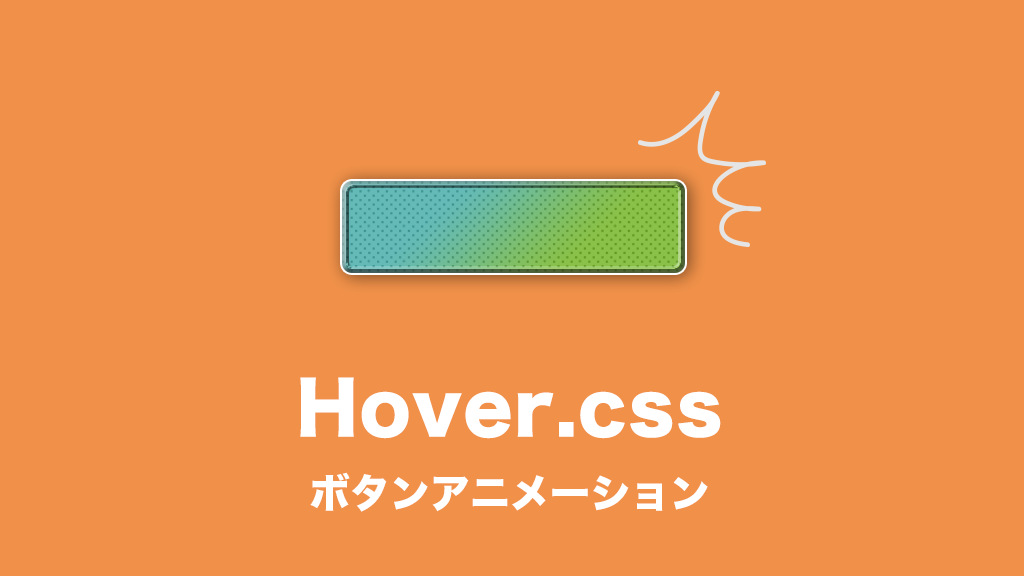
「Hover.css」を使ってアニメーション
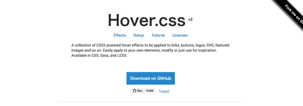
リンク、ボタン、ロゴ、SVG、おすすめ画像などに適用される、CSS3のアニメーション付きホバー効果のコレクションです。自分の要素に簡単に適用したり、変更したり、インスピレーションのために使います。CSS、Sass、LESSで利用可能です。
CSSだけで実装可能なのでとっても手軽です。
エフェクト数は119個!!すんごいボリューム!!
「Hover.css」のサイトでgit経由でサンプル含めDL出来ますが、なんせ数が膨大なので目当てのCSSファイルを探すのがちょいと手間で…「Hover.css」内で使いやすそうなアニメーションエフェクトをピックアップしてサンプルをコピペできるようにしました。
完全に自分用じゃないか。一発コピペって最高だよね!!
ライセンス
「Hover.css」は、無料の個人用/オープンソースまたは有料の商用ライセンスの下で利用できます。
個人サイトで使う場合は無料で使用できますよ!
商用ライセンスの費用ですがお客さんのサイトに埋め込む場合は14ドル、アプリやテンプレートとして販売する場合は18ドルになります。
売り切りで安いです!
詳しくはライセンス項目でチェックです。
「Hover.css」表示一覧
Grow
Shrink
Pulse
Pulse Grow
Pulse Shrink
Push
Pop
Bounce In
Bounce Out
Rotate
Grow Rotate
Float
Sink
Bob
Hang
Skew
Skew Forward
Skew Backward
Wobble Horizontal
Wobble Vertical
Wobble To Bottom Right
Wobble To Top Right
Wobble Top
Wobble Bottom
Wobble Skew
Buzz
Buzz Out
Forward
Backward
Fade
Back Pulse
Sweep To Right
Sweep To Left
Sweep To Bottom
Sweep To Top
Bounce To Right
Bounce To Left
Bounce To Bottom
Bounce To Top
Radial Out
Radial In
Rectangle In
Rectangle Out
Shutter In Horizontal
Shutter Out Horizontal
Shutter In Vertical
Shutter Out Vertical
Border Fade
Hollow
Trim
Ripple Out
Ripple In
Outline Out
Outline In
Round Corners
Underline From Left
Underline From Center
Underline From Right
Reveal
Underline Reveal
Overline Reveal
Overline From Left
Overline From Center
Overline From Right
Shadow
Grow Shadow
Float Shadow
Glow
Shadow Radial
Box Shadow Outset
Box Shadow Inset
Bubble Top
Bubble Right
Bubble Bottom
Bubble Left
Bubble Float Top
Bubble Float Right
Bubble Float Bottom
Bubble Float Left
Curl Top Left
Curl Top Right
Curl Bottom Right
Curl Bottom Left
「Hover.css」動きのサンプル
拡張されるボタン
Grow
コピー
<a href="#" class="hvr-grow">Grow</a>
コピー
/* Grow */
.hvr-grow {
  display: inline-block;
  vertical-align: middle;
  -webkit-transform: perspective(1px) translateZ(0);
  transform: perspective(1px) translateZ(0);
  box-shadow: 0 0 1px rgba(0, 0, 0, 0);
  -webkit-transition-duration: 0.3s;
  transition-duration: 0.3s;
  -webkit-transition-property: transform;
  transition-property: transform;
}
.hvr-grow:hover, .hvr-grow:focus, .hvr-grow:active {
  -webkit-transform: scale(1.1);
  transform: scale(1.1);
}
縮むボタン
Shrink
コピー
<a href="#" class="hvr-shrink">Shrink</a>
コピー
/* Shrink */
.hvr-shrink {
  display: inline-block;
  vertical-align: middle;
  -webkit-transform: perspective(1px) translateZ(0);
  transform: perspective(1px) translateZ(0);
  box-shadow: 0 0 1px rgba(0, 0, 0, 0);
  -webkit-transition-duration: 0.3s;
  transition-duration: 0.3s;
  -webkit-transition-property: transform;
  transition-property: transform;
}
.hvr-shrink:hover, .hvr-shrink:focus, .hvr-shrink:active {
  -webkit-transform: scale(0.9);
  transform: scale(0.9);
}
ボインボインするボタン
Pulse
コピー
<a href="#" class="hvr-pulse">Pulse</a>
コピー
/* Pulse */
@-webkit-keyframes hvr-pulse {
  25% {
    -webkit-transform: scale(1.1);
    transform: scale(1.1);
  }
  75% {
    -webkit-transform: scale(0.9);
    transform: scale(0.9);
  }
}
@keyframes hvr-pulse {
  25% {
    -webkit-transform: scale(1.1);
    transform: scale(1.1);
  }
  75% {
    -webkit-transform: scale(0.9);
    transform: scale(0.9);
  }
}
.hvr-pulse {
  display: inline-block;
  vertical-align: middle;
  -webkit-transform: perspective(1px) translateZ(0);
  transform: perspective(1px) translateZ(0);
  box-shadow: 0 0 1px rgba(0, 0, 0, 0);
}
.hvr-pulse:hover, .hvr-pulse:focus, .hvr-pulse:active {
  -webkit-animation-name: hvr-pulse;
  animation-name: hvr-pulse;
  -webkit-animation-duration: 1s;
  animation-duration: 1s;
  -webkit-animation-timing-function: linear;
  animation-timing-function: linear;
  -webkit-animation-iteration-count: infinite;
  animation-iteration-count: infinite;
}
もっとボインボインするボタン
Pulse Grow
コピー
<a href="#" class="hvr-pulse-grow">Pulse Grow</a>
コピー
/* Pulse Grow */
@-webkit-keyframes hvr-pulse-grow {
  to {
    -webkit-transform: scale(1.1);
    transform: scale(1.1);
  }
}
@keyframes hvr-pulse-grow {
  to {
    -webkit-transform: scale(1.1);
    transform: scale(1.1);
  }
}
.hvr-pulse-grow {
  display: inline-block;
  vertical-align: middle;
  -webkit-transform: perspective(1px) translateZ(0);
  transform: perspective(1px) translateZ(0);
  box-shadow: 0 0 1px rgba(0, 0, 0, 0);
}
.hvr-pulse-grow:hover, .hvr-pulse-grow:focus, .hvr-pulse-grow:active {
  -webkit-animation-name: hvr-pulse-grow;
  animation-name: hvr-pulse-grow;
  -webkit-animation-duration: 0.3s;
  animation-duration: 0.3s;
  -webkit-animation-timing-function: linear;
  animation-timing-function: linear;
  -webkit-animation-iteration-count: infinite;
  animation-iteration-count: infinite;
  -webkit-animation-direction: alternate;
  animation-direction: alternate;
}
縮んでボインボインするボタン
Pulse Shrink
コピー
<a href="#" class="hvr-pulse-shrink">Pulse Shrink</a>
コピー
/* Pulse Shrink */
@-webkit-keyframes hvr-pulse-shrink {
  to {
    -webkit-transform: scale(0.9);
    transform: scale(0.9);
  }
}
@keyframes hvr-pulse-shrink {
  to {
    -webkit-transform: scale(0.9);
    transform: scale(0.9);
  }
}
.hvr-pulse-shrink {
  display: inline-block;
  vertical-align: middle;
  -webkit-transform: perspective(1px) translateZ(0);
  transform: perspective(1px) translateZ(0);
  box-shadow: 0 0 1px rgba(0, 0, 0, 0);
}
.hvr-pulse-shrink:hover, .hvr-pulse-shrink:focus, .hvr-pulse-shrink:active {
  -webkit-animation-name: hvr-pulse-shrink;
  animation-name: hvr-pulse-shrink;
  -webkit-animation-duration: 0.3s;
  animation-duration: 0.3s;
  -webkit-animation-timing-function: linear;
  animation-timing-function: linear;
  -webkit-animation-iteration-count: infinite;
  animation-iteration-count: infinite;
  -webkit-animation-direction: alternate;
  animation-direction: alternate;
}
押した感じのボタン
Push
コピー
<a href="#" class="hvr-push">Push</a>
コピー
/* Push */
@-webkit-keyframes hvr-push {
  50% {
    -webkit-transform: scale(0.8);
    transform: scale(0.8);
  }
  100% {
    -webkit-transform: scale(1);
    transform: scale(1);
  }
}
@keyframes hvr-push {
  50% {
    -webkit-transform: scale(0.8);
    transform: scale(0.8);
  }
  100% {
    -webkit-transform: scale(1);
    transform: scale(1);
  }
}
.hvr-push {
  display: inline-block;
  vertical-align: middle;
  -webkit-transform: perspective(1px) translateZ(0);
  transform: perspective(1px) translateZ(0);
  box-shadow: 0 0 1px rgba(0, 0, 0, 0);
}
.hvr-push:hover, .hvr-push:focus, .hvr-push:active {
  -webkit-animation-name: hvr-push;
  animation-name: hvr-push;
  -webkit-animation-duration: 0.3s;
  animation-duration: 0.3s;
  -webkit-animation-timing-function: linear;
  animation-timing-function: linear;
  -webkit-animation-iteration-count: 1;
  animation-iteration-count: 1;
}
押した感じがでかくなるのボタン
Pop
コピー
<a href="#" class="hvr-pop">Pop</a>
コピー
/* Pop */
@-webkit-keyframes hvr-pop {
  50% {
    -webkit-transform: scale(1.2);
    transform: scale(1.2);
  }
}
@keyframes hvr-pop {
  50% {
    -webkit-transform: scale(1.2);
    transform: scale(1.2);
  }
}
.hvr-pop {
  display: inline-block;
  vertical-align: middle;
  -webkit-transform: perspective(1px) translateZ(0);
  transform: perspective(1px) translateZ(0);
  box-shadow: 0 0 1px rgba(0, 0, 0, 0);
}
.hvr-pop:hover, .hvr-pop:focus, .hvr-pop:active {
  -webkit-animation-name: hvr-pop;
  animation-name: hvr-pop;
  -webkit-animation-duration: 0.3s;
  animation-duration: 0.3s;
  -webkit-animation-timing-function: linear;
  animation-timing-function: linear;
  -webkit-animation-iteration-count: 1;
  animation-iteration-count: 1;
}
ボインボインして拡大後止まるボタン
Bounce In
コピー
<a href="#" class="hvr-bounce-in">Bounce In</a>
コピー
/* Bounce In */
.hvr-bounce-in {
  display: inline-block;
  vertical-align: middle;
  -webkit-transform: perspective(1px) translateZ(0);
  transform: perspective(1px) translateZ(0);
  box-shadow: 0 0 1px rgba(0, 0, 0, 0);
  -webkit-transition-duration: 0.5s;
  transition-duration: 0.5s;
}
.hvr-bounce-in:hover, .hvr-bounce-in:focus, .hvr-bounce-in:active {
  -webkit-transform: scale(1.2);
  transform: scale(1.2);
  -webkit-transition-timing-function: cubic-bezier(0.47, 2.02, 0.31, -0.36);
  transition-timing-function: cubic-bezier(0.47, 2.02, 0.31, -0.36);
}
ボインボインして縮小後止まるボタン
Bounce Out
コピー
<a href="#" class="hvr-bounce-out">Bounce Out</a>
コピー
/* Bounce Out */
.hvr-bounce-out {
  display: inline-block;
  vertical-align: middle;
  -webkit-transform: perspective(1px) translateZ(0);
  transform: perspective(1px) translateZ(0);
  box-shadow: 0 0 1px rgba(0, 0, 0, 0);
  -webkit-transition-duration: 0.5s;
  transition-duration: 0.5s;
}
.hvr-bounce-out:hover, .hvr-bounce-out:focus, .hvr-bounce-out:active {
  -webkit-transform: scale(0.8);
  transform: scale(0.8);
  -webkit-transition-timing-function: cubic-bezier(0.47, 2.02, 0.31, -0.36);
  transition-timing-function: cubic-bezier(0.47, 2.02, 0.31, -0.36);
}
背景色が下からにゅーんとボタン
Sweep To Top
コピー
<a href="#" class="hvr-sweep-to-top">Sweep To Top</a>
コピー
/* Sweep To Top */
.hvr-sweep-to-top {
  display: inline-block;
  vertical-align: middle;
  -webkit-transform: perspective(1px) translateZ(0);
  transform: perspective(1px) translateZ(0);
  box-shadow: 0 0 1px rgba(0, 0, 0, 0);
  position: relative;
  -webkit-transition-property: color;
  transition-property: color;
  -webkit-transition-duration: 0.3s;
  transition-duration: 0.3s;
}
.hvr-sweep-to-top:before {
  content: "";
  position: absolute;
  z-index: -1;
  top: 0;
  left: 0;
  right: 0;
  bottom: 0;
  background: #2098D1;
  -webkit-transform: scaleY(0);
  transform: scaleY(0);
  -webkit-transform-origin: 50% 100%;
  transform-origin: 50% 100%;
  -webkit-transition-property: transform;
  transition-property: transform;
  -webkit-transition-duration: 0.3s;
  transition-duration: 0.3s;
  -webkit-transition-timing-function: ease-out;
  transition-timing-function: ease-out;
}
.hvr-sweep-to-top:hover, .hvr-sweep-to-top:focus, .hvr-sweep-to-top:active {
  color: white;
}
.hvr-sweep-to-top:hover:before, .hvr-sweep-to-top:focus:before, .hvr-sweep-to-top:active:before {
  -webkit-transform: scaleY(1);
  transform: scaleY(1);
}
ボーダーがセンターから伸びるボタン
Underline From Center
コピー
<a href="#" class="hvr-underline-from-center">Underline From Center</a>
コピー
/* Underline From Center */
.hvr-underline-from-center {
  display: inline-block;
  vertical-align: middle;
  -webkit-transform: perspective(1px) translateZ(0);
  transform: perspective(1px) translateZ(0);
  box-shadow: 0 0 1px rgba(0, 0, 0, 0);
  position: relative;
  overflow: hidden;
}
.hvr-underline-from-center:before {
  content: "";
  position: absolute;
  z-index: -1;
  left: 51%;
  right: 51%;
  bottom: 0;
  background: #2098D1;
  height: 4px;
  -webkit-transition-property: left, right;
  transition-property: left, right;
  -webkit-transition-duration: 0.3s;
  transition-duration: 0.3s;
  -webkit-transition-timing-function: ease-out;
  transition-timing-function: ease-out;
}
.hvr-underline-from-center:hover:before, .hvr-underline-from-center:focus:before, .hvr-underline-from-center:active:before {
  left: 0;
  right: 0;
}
波紋が広がボタン
Ripple Out
コピー
<a href="#" class="hvr-ripple-out">Ripple Out</a>
コピー
/* Ripple Out */
@-webkit-keyframes hvr-ripple-out {
  100% {
    top: -12px;
    right: -12px;
    bottom: -12px;
    left: -12px;
    opacity: 0;
  }
}
@keyframes hvr-ripple-out {
  100% {
    top: -12px;
    right: -12px;
    bottom: -12px;
    left: -12px;
    opacity: 0;
  }
}
.hvr-ripple-out {
  display: inline-block;
  vertical-align: middle;
  -webkit-transform: perspective(1px) translateZ(0);
  transform: perspective(1px) translateZ(0);
  box-shadow: 0 0 1px rgba(0, 0, 0, 0);
  position: relative;
}
.hvr-ripple-out:before {
  content: '';
  position: absolute;
  border: #e1e1e1 solid 6px;
  top: 0;
  right: 0;
  bottom: 0;
  left: 0;
  -webkit-animation-duration: 1s;
  animation-duration: 1s;
}
.hvr-ripple-out:hover:before, .hvr-ripple-out:focus:before, .hvr-ripple-out:active:before {
  -webkit-animation-name: hvr-ripple-out;
  animation-name: hvr-ripple-out;
}
浮かんで影がつくボタン
Grow Shadow
コピー
<a href="#" class="hvr-grow-shadow">Grow Shadow</a>
コピー
/* Grow Shadow */
.hvr-grow-shadow {
  display: inline-block;
  vertical-align: middle;
  -webkit-transform: perspective(1px) translateZ(0);
  transform: perspective(1px) translateZ(0);
  box-shadow: 0 0 1px rgba(0, 0, 0, 0);
  -webkit-transition-duration: 0.3s;
  transition-duration: 0.3s;
  -webkit-transition-property: box-shadow, transform;
  transition-property: box-shadow, transform;
}
.hvr-grow-shadow:hover, .hvr-grow-shadow:focus, .hvr-grow-shadow:active {
  box-shadow: 0 10px 10px -10px rgba(0, 0, 0, 0.5);
  -webkit-transform: scale(1.1);
  transform: scale(1.1);
}
押してる感じのボタン
Box Shadow Inset
コピー
<a href="#" class="hvr-box-shadow-inset">Box Shadow Inset</a>
コピー
/* Box Shadow Inset */
.hvr-box-shadow-inset {
  display: inline-block;
  vertical-align: middle;
  -webkit-transform: perspective(1px) translateZ(0);
  transform: perspective(1px) translateZ(0);
  box-shadow: 0 0 1px rgba(0, 0, 0, 0);
  -webkit-transition-duration: 0.3s;
  transition-duration: 0.3s;
  -webkit-transition-property: box-shadow;
  transition-property: box-shadow;
  box-shadow: inset 0 0 0 rgba(0, 0, 0, 0.6), 0 0 1px rgba(0, 0, 0, 0);
  /* Hack to improve aliasing on mobile/tablet devices */
}
.hvr-box-shadow-inset:hover, .hvr-box-shadow-inset:focus, .hvr-box-shadow-inset:active {
  box-shadow: inset 2px 2px 2px rgba(0, 0, 0, 0.6), 0 0 1px rgba(0, 0, 0, 0);
  /* Hack to improve aliasing on mobile/tablet devices */
}
吹き出しが出てくるボタン
Bubble Float Top
コピー
<a href="#" class="hvr-bubble-float-top">Bubble Float Top</a>
コピー
/* Bubble Float Top */
.hvr-bubble-float-top {
  display: inline-block;
  vertical-align: middle;
  -webkit-transform: perspective(1px) translateZ(0);
  transform: perspective(1px) translateZ(0);
  box-shadow: 0 0 1px rgba(0, 0, 0, 0);
  position: relative;
  -webkit-transition-duration: 0.3s;
  transition-duration: 0.3s;
  -webkit-transition-property: transform;
  transition-property: transform;
}
.hvr-bubble-float-top:before {
  position: absolute;
  z-index: -1;
  content: '';
  left: calc(50% - 10px);
  top: 0;
  border-style: solid;
  border-width: 0 10px 10px 10px;
  border-color: transparent transparent #e1e1e1 transparent;
  -webkit-transition-duration: 0.3s;
  transition-duration: 0.3s;
  -webkit-transition-property: transform;
  transition-property: transform;
}
.hvr-bubble-float-top:hover, .hvr-bubble-float-top:focus, .hvr-bubble-float-top:active {
  -webkit-transform: translateY(10px);
  transform: translateY(10px);
}
.hvr-bubble-float-top:hover:before, .hvr-bubble-float-top:focus:before, .hvr-bubble-float-top:active:before {
  -webkit-transform: translateY(-10px);
  transform: translateY(-10px);
}
まとめ
「Hover.css」のサンプル一例でした。紹介したのは15個ですが上のリストにあるような動きが全て表現できます。
このライブラリさえあれば基本の動きはマスターです!
是非ダウンロードして使ってみてくださいね。